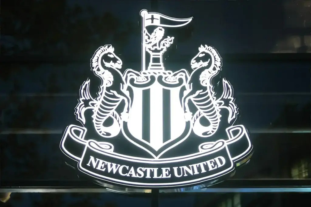

Newcastle’s new crest has won its first contest. The more important test will come when supporters stop discussing the announcement and start living with the result.
A badge has to work on a shirt, a scarf, a phone screen and the outside of a stadium. It also has to feel right to somebody whose attachment to it began long before a design team started considering its limitations.
Those demands can pull in different directions.
Newcastle deserve credit for recognising that tension. However, a successful consultation should be the beginning of the club’s responsibility, rather than the point at which supporters are expected to stop asking questions.
What the Newcastle new crest vote actually tells us
As we reported in our coverage of Newcastle’s crest announcement, Option C received 64.8% of first-choice votes.
The club’s published consultation results record 27,348 completed responses from an eligible audience of 118,658. That is approximately 23% participation.
The winning option also secured majority support in each reported supporter category. That is a convincing result within the poll.
There is an important distinction, though. Participants ranked three proposed designs. The final ballot was not a straight choice between changing the badge and retaining the previous version.
Earlier consultation addressed the direction of the project, but those stages should not be collapsed into a claim that nearly two-thirds of all Newcastle supporters demanded a new crest.
Equally, non-participation cannot reasonably be counted as opposition. We do not know why individual supporters chose not to respond.
The fair conclusion is specific: one design clearly defeated the alternatives offered to participating supporters.
That gives Newcastle a sound basis for proceeding. It does not make every criticism of the outcome unreasonable.
Newcastle’s identity should remain the strongest feature
The most important design decision was to preserve the badge’s connection with its city.
The Premier League’s explanation of club crests traces Newcastle’s castle to the fortress that gave the city its name. The creatures beside the shield are hippocampi, reflecting its maritime heritage.
Those details provide something a generic football symbol cannot: a reason for this badge to belong to this particular place.
Modern football makes it easy to talk about reaching new audiences. The danger comes when that ambition encourages clubs to strip away the features which made them interesting in the first place.
Somebody discovering Newcastle from another country does not need the club to look interchangeable with every other team. Learning what the badge means can be part of becoming attached to it.
That is why the familiar structure matters more than whether every supporter immediately prefers each redrawn line.
The Creative Review introduction to the project also places the crest within a broader visual identity, including bespoke typography and a secondary mark.
That wider system deserves scrutiny as it appears. A carefully preserved main badge can still feel diminished if the surrounding presentation becomes anonymous.
Newcastle should explain the purpose of those additional elements and show where each belongs. Supporters should not need a design qualification to understand what represents their club.
Consistency is useful. Familiarity is valuable. Neither requires every item to look identical.
The practical argument needs a practical demonstration
Newcastle’s explanation for the change rests partly on reproduction.
In the official announcement, the club says the previous design could lose definition on screens, broadcast graphics and embroidered clothing. The revised version is intended to address those limitations.
That is a reasonable problem to investigate. It is also a claim supporters should be able to assess for themselves.
The most persuasive demonstration would be straightforward: show the old and new versions at the same small size, on comparable fabric and against equivalent backgrounds.
A large promotional image can make almost any carefully presented design look impressive. The difficult test is whether the important details remain legible during ordinary use.
For example, can the club name be read on a small embroidered badge? Does the shield remain clear beside a score graphic? Does a single-colour version preserve the identity without losing essential features?
These are proposed tests, rather than claims that the new design has already passed or failed them.
They would also make the conversation more useful. Supporters could judge an actual improvement instead of being asked to accept broad promises about modernisation.
There is room for disagreement even then. A technically cleaner image will not automatically become somebody’s favourite.
That should be understood as a normal response to changing a familiar symbol. Newcastle can explain the benefits without treating affection for the previous crest as a problem to overcome.
The rollout will matter more than the launch language
The club plans to introduce the crest progressively across signage and digital platforms, with its appearance on kits scheduled for 2027/28.
A phased change makes clear communication particularly important.
Supporters buying merchandise should be able to understand which identity appears on a product, what has already changed and what remains part of the transition.
Clear photographs and descriptions would do more for that confidence than repeated claims about a new era.
There is also an opportunity to treat the previous badge with care. Newcastle should continue explaining its place in the club’s history, allowing supporters to appreciate the updated design without feeling that their old shirts and memories have been pushed aside.
That is an editorial recommendation, not evidence that the club intends to do otherwise.
The same principle applies to the commercial argument. A refreshed identity may give Newcastle more consistent ways to present themselves, but a badge announcement cannot demonstrate increased revenue or a stronger football team.
Those outcomes require separate evidence.
Supporters are entitled to enjoy a design project without being told it proves progress in every other part of the club. They are equally entitled to remain unconvinced while judging the team, recruitment and matchday experience on their own merits.
My verdict is cautiously positive. Retaining the recognisable identity was the right starting point, and publishing the consultation details gives supporters something concrete to examine.
The responsibility now is to carry that openness into the rollout.
Show the improvements. Explain the changes. Respect the old badge. Make the new version work properly wherever supporters encounter it.
If Newcastle manage that, the crest can gradually become familiar through ordinary football life: shirts worn, matches attended and moments remembered.
That is how a design becomes part of a club.






Comments.
Loading comments…